

Style Guide 101: What They Are & Why You Need One
If you’re a blogger who hasn’t heard the term “style guide”, you must be living under a rock. If that’s you, don’t worry. This post should help.
Having a style guide for your blog is helpful not only for you, but it’s also incredibly helpful for anyone you hire to design graphics for your blog.
So what exactly is a style guide?
A style guide is a document that provides guidelines for the way your blog’s brand must be presented.
Style guides do three main things:
-
They inform.
Your style guide’s most basic job is to teach everyone who sees it what your blog’s brand is, and how to implement it. This includes things like the fonts and colours you use, the style of photographs you use, and the way your blog’s logo can be used. Many corporate style guides go super in-depth and even cover things like the writing styles that can be used. As a blogger, you don’t have to include that much detail in your style guide, however if your blog does grow and you take on many guest writers, it might be a good idea to create a writing style guide as well.
-
They inspire.
It’s helpful for a style guide to include examples of what can be done with the material presented. For large corporations and brands, this includes things like interior design and collateral that might be created with the brand’s logo on it. For bloggers, this includes things like social media graphics and promo images.
-
They enforce.
At the end of the day, your blog guidelines need to be enforceable, and that means that you need to spell out the do’s and don’ts. Style guides ensure consistency, providing clear direction as to what can be done and what can’t be done with your blog’s assets. When it comes to your blog and all of the content you create for it, consistency is key. As your blog grows, your style guide remains the same. It’s the one thing that ensures all of your content looks and feels the same, time after time. Consistency breeds familiarity, and familiarity increases recall with your audience, which also helps establish a recurring connection with them.
THE BASIC BLOG STYLE GUIDE
As a blogger, your style guide helps keep YOU on track so you don’t stray from the intentions you originally set for your blog. It’s easy to see something on someone else’s blog and then want to do something similar on your own.
Alisha Nicole confirmed this when she told me:
A style guide has helped me to stay consistent when it comes to my brand. I am easily swayed by pretty colors and am often tempted to use a color or font that’s not on brand. So a style guide helps me to keep myself in check! As a designer, a style guide has helped me to wrangle in all of my ideas and pick one specific and cohesive style.
This happens to me a lot. My personal design style is pretty mod/retro, but some days I just want to don a crown of flowers, use only earthtones, and get my boho chic on. My style guide helps keep me in line:
As a design VA, your style guide helps me design content that looks like everything else on your blog. Instead of having to guess which colours and fonts you’re using (or even ask), when you provide me with a style guide, the amount of time it takes for me to familiarize myself with your blog and your blog’s brand is cut in half.
One of my favorite fellow web and graphic designers is Rekita Nicole. I love everything she does, and I especially love her own personal brand because it’s super colorful and bold, which really appeals to me (as you can probably tell; I ain’t got time for beige). She posted about her own branding process on her blog in January. She provides a great overview of the branding process, but I want to particularly highlight the basic style guide she shared, shown on the left, and just how accurately it reflects her website, shown on the right:
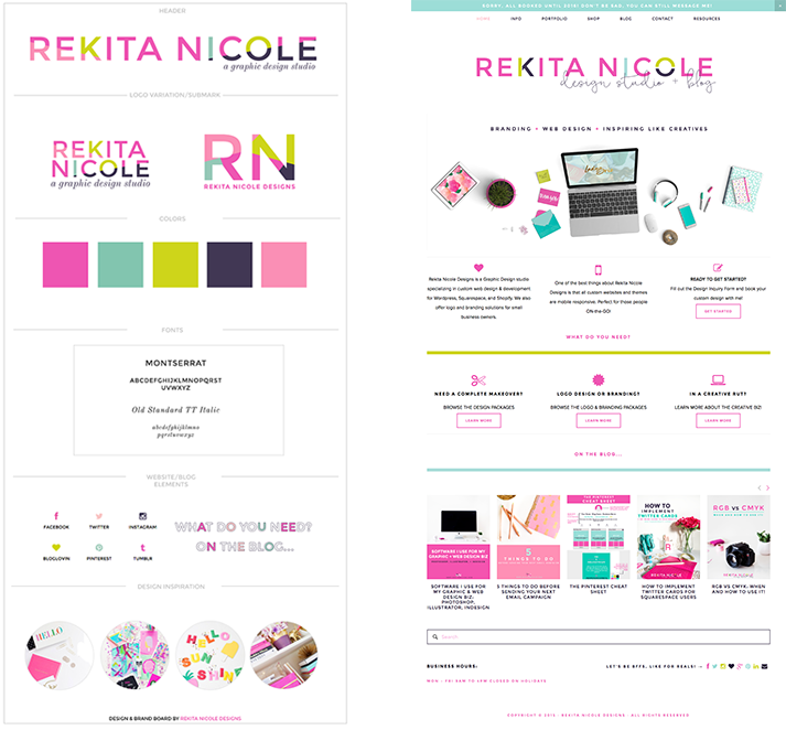
It’s obvious that Rekita uses her style guide to influence the graphics she creates for her blog, the photographs she uses and takes, as well as the website design itself.
Rekita explained to me why she always likes to create style guides when working on branding projects for her clients:
A style guide is so important for me as a designer to create for my client. It shows my client the visual of his her brand and how to apply to their website, business cards, future events, and etc. It is important for a style guide to include their brand colors, fonts, and style in order for their brand to have a cohesive and consistent look across the board. A style guide gives only a smidgen of what their actual brand is, but it does give the client direction on how to style their brand and other collateral items.
THE NOT-SO-BASIC STYLE GUIDE
At my day job, I work as a corporate brand designer for a large financial company. One of my responsibilities is to ensure that all the graphics I make, as well as the graphics made by designers in other departments, reflect the company’s style guide, a document referred to as the “brand standards”.
This brand standards document is super in-depth. It goes over all of the same things that a basic style guide does, along with a whole bunch of other stuff: what you can do with the logo, what you can’t do with the logo, what fonts to use and how to use them, what style of stock photos to use, how the company’s name came be written out, how and where to use the slogan, and so much more. Like I said, super in-depth, but incredibly helpful. Whenever the company hires a new designer, this brand standards document acts as their guide to becoming familiar with the brand. After 2 years in my role, I practically know it off by heart.
Check out this one for Jamie Oliver’s brand. It’s the perfect example of just how detailed corporate style guides (or brand standards) can be. Note that this one covers physical products, which is why it’s so detailed.
Let’s take a look at some of the pages.
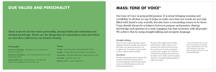
Page 7 goes over the difference between “Jamie the person” and “Jamie the brand”, while page 11 describes the brand’s values and personality. These are essentially the foundation that Jamie’s brand is built on, and you probably aren’t surprised by some of them if you’re familiar with Jamie Oliver. You probably won’t find “approachable and fun” listed as a personality trait in Gordon Ramsey’s brand standards (I do love him though).
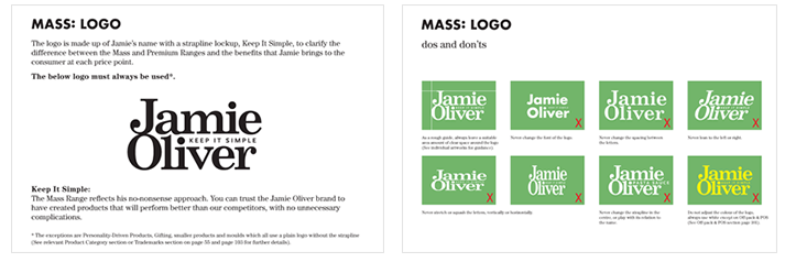
Pages 13 and 14 talk about the logo, providing a detailed overview of how you can and can’t use it.
Pages 17-20 cover the brand’s color palette. I’m not going to lie, this is one of the biggest corporate color palettes I’ve ever seen. I wish my day job’s brand had a color palette this diverse!
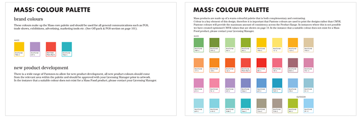
Page 25 tells you about the brand’s fonts, including which to use for headlines, which to use for descriptions, and how to typeset headlines. There’s also a link to purchase the fonts from Adobe. Page 30 gives an example of how a product label should look, as well as several examples of how a product label SHOULDN’T look. It’s always good to be as specific as possible when it comes to brand standards and guidelines.
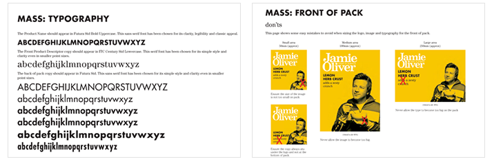
Page 21 shows how to combine photos of Jamie with brand colors. You’ll notice that Jamie’s photo always appears in monochrome with a background color wash using one of the colors from the brand color palette. Page 39 gives examples of how to design the sides of the packaging for Jamie’s products. Yes, THE SIDES! That’s how specific it is. If you take a look at the full document, you’ll find pages supporting other specifics, like the fronts and backs of product packaging.
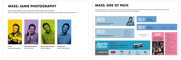
That’s just a small sample of the 104 pages that make up Jamie Oliver’s brand standards! 104! Now THAT is what I call detailed. But being as specific as it about practically all aspects of the brand is incredibly helpful for graphic designers, copywriters, advertisers, and anyone else hired to work on the brand. A quick look at the document should be more than enough to ensure consistency no matter how many people are involved. And like I said, this document covers physical products.
If your blog/biz has physical or even digital products, you definitely need a detailed style guide like this (but shorter–between 5-10 pages long) to keep yourself on track and to maintain brand consistency. It probably doesn’t go into the amount of detail Jamie Oliver’s brand standards document does, but it never hurts to include a “what not to do” section in your style guide. On the other hand, a simple one page document like the one I created for my blog, or the one Rekita uses, is perfect for a blog. It covers the logo, color palette, fonts, web elements, and any additional information that might be helpful like photography styles, patterns, and a screenshot of the website.
So, now that you’ve got all this (possibly new) style guide knowledge, think about your own blog/biz. What does its style guide look like? You might want to add a couple things I’ve mentioned to your existing style guide after reading this.
If you haven’t created a style guide yet, don’t you worry! I’ve got ya covered, as usual.
I’ve created a template for you to use to create a style guide for your brand, along with a step-by-step document to guide you through the process.
Check out these other blog posts on style guides. Some of them come with free style guide templates as well, so you can create a variety of different style guides for your blog, or just find one that suits your preference.
How + Why to Create a Style Guide for Your Brand by Maya Elious
How to Create a Style Guide for Your Blog by Regina
How + Why to Create a Style Guide for Your Blog by Melyssa at The Nectar Collective
PS: I would LOVE to see what you do with the template I’ve created for you! Send me a link to your style guide in the comments.

Robyn Petrik
I did my own rebrand over the summer and created a style guide for the first time, and man, that thing is SUPER helpful! It makes everything easier, from designing the website to putting together random images I suddenly want. Love the examples you’ve used here. Rekita Nicole’s branding is gorgeous!
Jillian Adriana
Right?! I love her style. So great to hear how helpful your own style guide is for you!
Viktoria Brindisi
Hi, Just filled in my name and email and it didn’t download. Could there be a glitch?
Viktoria Brindisi
Just kidding, got the email, lol. Thank you!