

3 Things To Do Before You Hit Publish
Blog posts aren’t just about putting your thoughts and feelings on a particular subject into words. They have to add value and offer actionable steps for your readers to take to achieve something.
1. Create a content upgrade
When you look at the blog posts of top bloggers Mariah Coz, Maya Elious, Melyssa Griffin (a bit of unintentional but ever-so-pleasing alliteration there), you’ll notice that they always include some type of content upgrade for their readers.
A content upgrade is something you offer that is valuable to your readers in exchange for something that is valuable to you, usually an email address. It can be virtually anything! It can be as simple as a list of apps that you love to use to organize your daily life, a printable worksheet, or even a free Photoshop template. It’s up to you, but make sure it’s something you’d want to receive. Remember, content upgrades are all about providing value to your readers!
One of the hidden benefits of using a content upgrade is that it’s a great way to build your email list! While an email address may not seem all that valuable to your readers, especially in exchange for the brilliantly valuable content they’re getting from you, what they don’t realize is that every email that gets submitted gets added to your email list! Pretty sneaky, eh? And your readers just think you’re being nice! Oh no no, my friend, there is always a strategy behind any blogger’s generosity (unless they specifically say otherwise and literally ask for nothing in return). Building your email list is important because it’s your key to guaranteed readership, building loyalty, and it’s a great way to drive sales when the time comes.
Why do content upgrades work so well? Because when it comes to blogging and building an online community, you want to be more like Michael Bublé who promises to give so much more than he gets, than the chick from that Bruno Mars song who always takes takes takes takes but she never gives.
Yea, lame analogy but stick with me, ok? When Michael Bublé says he’ll give more than he gets, I believe him. Maybe it’s just his perfect voice or beautiful smile, but let’s be honest here, I am sold! I’m ready to give him my undying love and attention, and already packing my bags to move to Vancouver, or wherever the heck he lives, to be with him. That’s how you want your readers to feel! You want their reaction to be the equivalent of that emoticon with the heart eyes because of how much they love you and how awesome your content is.
On the other hand, no one likes the chick Bruno Mars sings about in Grenade. She’s clearly a tool. I mean, Bruno flat out says “All you do is take, take, take, take, but you never give” and yet he still offers to catch a grenade for her. You know what I’d do? I’d throw that grenade right at the tramp. I bet Bruno would give her his email address in a heartbeat. Then he would die because it would turn out that the submit button is secretly a grenade.
My point is that providing value is all about give and take. A simple content upgrade is the easiest way to get your foot in the door that most people tend to keep locked and dead bolted.
2. Create promo graphics for your content upgrade
A simple “click here for awesome stuff” button might be enough to move most of your readers to action, but a little visual assistance never hurt anyone (or their brand).
Has a cashier at a store ever randomly asked you for your email address? You usually say no, right? Yea, me too. But if they tell me WHY they’re asking for my email address, I’m more likely to give it to them (ie “Would you like to provide your email address and receive 30% off your next purchase?”). Your promo graphic needs to say more than just “click here to download” in order to get some traction. It should elaborate as to why your content upgrade is the bees knees and offer some type of preview.
Here’s a rundown of what most successful content upgrade promo graphics include:
- a title or call to action
- some type of visual representation of the actual content upgrade
- at least 3 bullet points highlighting how your content upgrade will improve your reader’s life
- your branding
- a link to the download
Here’s one I’ve created for this post (PS: don’t forget to grab it!):
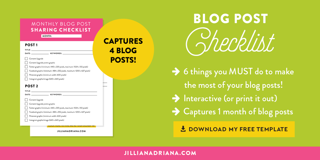 You can see that it includes all of the points I mentioned above. A large title, 3 bullet points that highlight why this checklist rocks and how it will help you be more efficient, and a redacted preview of the checklist. Offering a preview of your content upgrade is like letting someone shake their present to hear what’s inside. Offering a preview of your content upgrade is like letting someone shake their present to hear what's inside. Click To Tweet It gives your reader an idea of what they’re going to be getting without actually giving it away. If they want to see the real deal, they have to get your permission first. I’ve used the same brand fonts and colors that I’ve used throughout my website, and I added a little ribbon that tells you the checklist can be printed out, which is always handy for bloggers. I included my URL just in case the image gets shared anywhere, and I’ve added a bright yellow button to indicate that the graphic is clickable (I once heard my friend Mariah say that yellow buttons convert better, so I’m testing this theory out. Luckily, yellow is one of my brand colors, so it works out for me). It’s always a good idea to use a bright color for your button, just to grab a bit of extra attention.
3. Create social media graphics for your blog post
I’ve already established that visuals are always more enticing than a text-only call to action or promotion when it comes to blog graphics, and the same goes for your social media graphics. Creating graphics that match your brand’s style is ideal because not only does visual consistency scream “I’M A PROFESSIONAL AND I CARE ABOUT MY BRAND”, but it also helps breed familiarity between your readers and your brand. By using the same look and feel every time, your readers should be able to easily recognize one of your tweets/pins/posts when they quickly scroll through their social feeds. Hopefully they’ll stop when they see it and visit your blog to grab your freebie (and hop on your list)! Take a look at the social media graphics I’ve created for this post. You’ll see that they all look similar, and that they also look like the promo graphic I designed for my content upgrade, as well as the featured image at the top of this blog post: What do you see? HARMONY! They all look like one big, happy social media graphic family. The Facebook and Twitter graphics are the same, but I added a preview of the CU (content upgrade) on the Pinterest graphic. I also used a fun, brushy font and highlighted “On the blog:” on the Instagram graphic to add a bit of visual interest (brush/hand lettering are all the rage on Instagram), and to distinguish it from my other Instagram graphics/images. Now let’s be completely honest: doing all of this for EVERY blog post is a lot of work, but it’s critical if you want to be seen and heard. Enter my super awesome content upgrade! This monthly checklist will help you accomplish everything I’ve mentioned without losing your marbles! I even broke it down into 6 detailed steps, complete with specs. PLUS, it’s an interactive PDF, so you can fill it out right on your computer, or you can print it off and use the good old fashioned pencil and paper method! I use this checklist for my own blog, as well as the design VA work I do for clients like Maya Elious. It helps me streamline my design process and makes it easy to track the work as it gets done. Plus, I love checking things off of an actual list because it makes me feel like a productivity champ.
If you still find yourself struggling to do everything on the checklist (or whatever is applicable to your situation) for every blog post, I would love to help you! Designing this stuff is my jam, so send me an email and I’ll help you get back to doing more of what you love by taking over all of the stuff that I love to do.
May the blog post creation odds be ever in your favor.

Lindsey
LOVE LOVE LOVE this post!!! I totally see the design from Maya’s page! p.s. Mariah’s Yellow buttons are helping on my page too! Cheers!
Jillian Adriana
Thanks Lindsey! Love getting feedback like this!
Kaitlyn
This is a fantastic post, Jillian! I love your Michael Buble metaphor and the content is spot on. Great post! Sharing on Twitter!
- Kaitlyn | http://www.TheCrownFox.com
Jillian Adriana
Thanks lovely!
Kamila Gornia
OMFG. You are too amazing for words. Everything you create is like eyegasm.
That sounds weird. But yeah. You get the point.
<3